Hi everyone,
I’d like to be able to set the maximum width of the status overview in the personal settings as a user. In other words, I can specify a value in mm, pixels, or similar to determine how wide each entry in a group can be at most and whether it’s allowed to span multiple lines or not.
The background is the current update of the status overview. I really like the design overall.
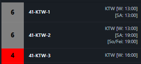
However, it’s causing vehicle categories (custom category) to suddenly be displayed on multiple lines in some cases, which takes up unnecessary space. Example:
Additionally, on some pages it’s possible to display 4 groups in width, but previously I could even fit 5 here, which I can no longer manage…
![]()
In other cases, suddenly only three groups are displayed in the overview in terms of width:
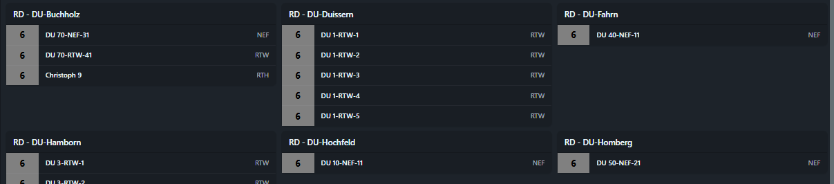
Nevertheless, there would be enough space based on the radio callsigns/categories to display all groups in the same width across all tabs. Unfortunately, I don’t know where the system gets the calculation for how wide it generates groups and when.
Alternatively, I’d think it would be great to work with the zoom in/out function. This would allow more flexibility to display status groups on a smaller area. The problem is that zoom always affects all windows at the same time and not each window individually. It would be important here to be able to zoom each window individually and then save it with the window view/grouping.
Best regards
Das würde ich auch für sehr sinnvoll betrachten.
– goddotIch wäre auch für eine Zoom-Funktion bzw. einer Variabilität in Abhängigkeit der zur Verfügung stehenden Fläche und der Auflösung. Bitte keine starren Werte...
– benjaminr